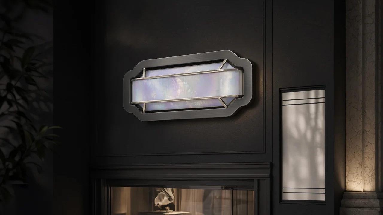
How to design remarkable signage with AI, without building an expensive mistake
Use AI to explore the visual direction, then design the actual sign around its message, viewing conditions, fabrication and approvals. The strongest result may combine a beautifully made permanent identity with one carefully chosen digital element. More technology is not automatically more impact.
This guide is written for Edmonton storefronts, and the same production checks apply for businesses across Alberta and Canada.
For an Edmonton business, a sign has to do its work on an actual building, for actual people approaching from a particular direction. A dazzling concept that hides the entrance, cannot be read across the parking lot or cannot be approved is still a bad sign.
This guide separates the creative possibilities from the production decisions. It also looks at documented developments from Samsung, LG and Epson, not speculative “future of retail” claims. Product details and official guidance were checked in November 2026. Availability and approval still need checking for your project.
Begin with the job, not the generator
Write one sentence describing what the sign must accomplish. “Help new customers identify our unit from the parking entrance” is useful. “Make something futuristic” is a mood, not a brief.
Then collect:
- Straight-on and wider photographs of the location, taken safely.
- Measured dimensions and the proposed sign area.
- The main approach directions and where people can stop to read.
- Existing brand files, including approved typefaces and colours.
- Landlord requirements and any existing sign plan.
- Whether the sign needs to work after dark.
- Who will operate, clean, update and repair it.
Record the difference between an observation and an assumption. “The wall receives direct afternoon sun” should come from looking at the site, not a generated image. “Customers will approach on foot” needs checking against how people actually arrive.
Give the sign one primary message. If the business name does not explain the offer, add a short descriptor. Put detailed services and changing promotions somewhere designed for reading, rather than compressing everything into the fascia.
Where AI genuinely helps
AI is useful for exploring material direction, composition, imagery and alternative treatments before committing to production. It is less useful as the final authority on spelling, dimensions, mounting or construction.
Adobe’s Text to Vector Graphic in Illustrator generates editable, scalable vector graphics. That makes it a relevant exploration tool for patterns and supporting artwork. It does not mean every generated path is a clean cutting file or a usable logo.
A productive sequence is:
- Create several distinct directions against the same brief.
- Compare them in the same photograph and at the same apparent scale.
- Choose a direction for its communication, not the most dramatic lighting.
- Rebuild important lettering and geometry deliberately.
- Ask the fabricator to review the design before the final artwork is locked.
Use only reference material you have permission to upload. Check the tool’s current terms for the feature and model you use. Permission to generate an image is not the same as clearance to reproduce another business’s identity.
A prompt that creates a useful comparison
Try this as a starting brief, using your own site photograph:
Produce three clearly different sign-design concepts for the supplied storefront photograph. Preserve the real door, windows, wall geometry and neighbouring units. Use the supplied identity without inventing wording. Direction one: restrained dimensional lettering. Direction two: a bold panel with a short service descriptor. Direction three: a permanent identity with a separate changing-message element. Show neutral daytime conditions. These are design concepts, not engineering drawings.
The important part is the constraint. If the model moves the door, widens the building or invents a canopy, reject the result as a site mockup. You can keep a colour idea without accepting its false architecture.
Add the real business name as properly typeset artwork after generation when necessary. Do not let an attractive image persuade you that a misspelled or distorted wordmark is ready for production.
Which technologies deserve a serious look?
Choose a technology for the information it needs to carry and the conditions it must survive. The table is a design decision aid, not a promise of suitability.
| Approach | A useful reason to consider it | What to resolve first |
|---|---|---|
| Dimensional or illuminated permanent identity | A recognisable business name that does not change every week | Readability, approved mounting, light appearance, maintenance and permits |
| Colour e-paper | A changing poster, product message or room notice without the visual feel of a bright video screen | Refresh behaviour, lighting, operating range, content management and local availability |
| Conventional commercial digital display | Regularly changing information or motion where it is allowed and useful | Brightness control, viewing conditions, content responsibility and service access |
| Projection | A controlled interior feature, launch or product demonstration | Ambient light, projection path, surface, alignment and equipment access |
| Printed graphics | A strong fixed or short-term message without a screen-management system | Substrate, finish, exposure, replacement and installation |
A permanent sign is not old-fashioned because it stays still. A changing screen is not innovative if the business has no useful changing content.
What colour e-paper changes, and what it does not
In January 2026, Samsung announced its 13-inch Color E-Paper EM13DX. The company describes a rechargeable embedded battery, USB Type-C support and content management through its E-Paper App and Samsung VXT. The display is intended for placements such as shelves, counters and doors.
The useful design idea is a remotely changeable, poster-like surface. That can make sense for a shop that updates product information but does not need video. Ask to see your actual artwork on the actual device before buying. Screen photographs do not tell you enough about small type, subtle gradients or the way colour looks in your space.
Samsung’s static-image power claim needs its qualification: content refresh, changes, monitoring and control require additional power. Do not translate “zero watts” for holding an image into “the installation uses no energy.” Battery life and overall operation are separate questions.
LG announced its 32-inch E-Paper Display in May 2026. Its release describes a reflective, backlight-free panel, remote management and integration with SuperSign CMS.
The same release contains a restriction that matters much more to an Alberta storefront than a launch photograph: LG specifies indoor use at 0°C to 40°C, restricts direct sunlight and says the warranty does not cover damage caused by window-facing installation. Do not treat that indoor product as an outdoor sign or assume it belongs in a sunny shop window.
These are manufacturer-described capabilities, not independent product tests by KR8TIV. Canadian availability, warranty, subscription costs and installation requirements must be confirmed with the supplier. A global announcement does not prove local stock.
When projection earns its place
Projection can put motion onto a surface without turning the whole interior into a wall of televisions. A restrained loop over a display plinth may be more useful than a large animation competing with the product.
Epson’s Creative Projection App supports creating content on iPhone or iPad and four-point correction for compatible projectors. Epson also documents LightScene retail and hospitality concepts, including projection mapping and product-focused experiences.
Those examples establish the technique, not a guaranteed result in your room. Before approving a projection concept, ask for a site test with the normal lighting on. Review it from customer positions, not just the projector’s best camera angle.
Work through the practical questions:
- Can customers or staff cross the beam?
- Does the surface have the colour and texture the image needs?
- What happens if a fixture moves?
- Can someone reach the equipment for service?
- Is the essential information available when the projector is off?
- Who supplies and updates the content?
Projection should support a clear product story. If nobody can explain what the moving image helps a customer understand, spend the budget on the sign, lighting or merchandising first.
Edmonton approvals belong in the first conversation
The City of Edmonton’s permanent-sign guidance says signs on private property require a sign permit except for the exemptions in Section 7.120 of the Zoning Bylaw. Signs with an electrical connection also require an electrical permit. Confirm the classification and requirements for the actual proposal before installation.
The City distinguishes Minor Digital Signs from Major Digital Signs. Its guidance describes Minor Digital Signs as displaying messages for six seconds or more without moving effects, transition effects, video or animation. Major Digital Signs may include those effects. A slow animation is still animation; do not assume a gentle loop avoids the relevant rules.
Zoning, sign type, advertising type and location affect the review. Signs extending over City property can also raise encroachment questions. Old Strathcona has additional signage guidance. A landlord’s permission is not a substitute for municipal approvals.
Ask who prepares the application and provides the dimensions, elevations, materials, illumination and engineering information where required. Do not design first and discover at the fabrication stage that nobody owns the permit work.
Other Alberta municipalities have their own requirements. Edmonton guidance is not a rulebook for every Canadian location.
Turn the visual concept into a fabrication package
Before requesting a final production quote, replace the moodboard with defined deliverables. A useful package identifies:
- Approved wording and a hierarchy of information.
- Sign dimensions and placement on a measured elevation.
- Vector artwork, type handling and colour references.
- Material and finish intent, with supplier confirmation still identified.
- Illumination intent and the proposed day/night appearance.
- Open questions for structural, electrical and installation specialists.
- The approval version and who is authorised to sign it off.
Ask the fabricator which files it needs. A PDF preview, an editable vector file and a cutting file are not interchangeable just because each can display the logo.
For colour-critical work, approve a physical sample or an appropriate production proof. A glowing screen and an opaque painted surface are different viewing conditions. Record the approved reference so later reprints are not matched to someone’s phone photograph.
For digital content, agree on resolution, aspect ratio, safe areas, file format and a fallback still. Keep contact details and essential information readable without waiting for a loop to restart.
Compare the whole operating commitment
Request quotes against the same scope. Separate concept design, production artwork, surveys, approvals, engineering, fabrication, electrical work, installation, content creation and ongoing management. Confirm taxes, access equipment, removal and making good where relevant.
For a connected display, include licences, network access, staff training and replacement arrangements. Ask what happens during a connection failure and who owns the administrator account. The owner should not need to find a former supplier to change a menu.
Do not compare one supplier’s bare screen price with another’s installed and managed system. Write down what each quote includes, then compare the missing items before deciding which is cheaper.
A concept review you can run before spending on production
Invite someone unfamiliar with the business to look at the proposal. Do not explain it first. Ask them to identify the name, the offer and where they would enter.
Then review the design in three conditions: a realistic approach view, a closer pedestrian view and the proposed after-dark condition. An image with exaggerated darkness and a dramatic spotlight is not an honest test of an ordinary afternoon.
For a fictional café, one good solution might be a permanent name above the door, clear opening information at pedestrian height and an indoor e-paper menu for changing offers. That is an illustration, not a KR8TIV case study. The point is to assign different jobs to different surfaces, not to insist that every business buys the same combination.
Keep the rejected directions and the reasons for rejecting them. They make later decisions easier when someone asks to restore the unreadable decorative lettering.
Frequently asked questions
Can AI produce a sign that is ready to manufacture?
It can help create artwork and concepts, but production readiness requires deliberate checks of wording, geometry, scale, materials and supplier requirements. AI output is not an engineering or permit approval.
Is colour e-paper suitable for an outdoor Edmonton storefront?
Not by default. Check the exact product’s environmental limits and warranty. LG’s cited 2026 indoor E-Paper Display restricts direct sunlight and excludes damage from window-facing installation from its warranty.
Does a digital sign always perform better than a printed one?
No. Changing information can justify a display. A permanent message may be better served by a clear fixed sign. Compare communication, upkeep and operating cost rather than assuming motion increases sales.
Does KR8TIV physically manufacture the sign?
KR8TIV’s signage service describes design and project management, with physical fabrication and installation handled by fabricators and builders. Confirm the exact scope and specialist responsibilities for your project.
Bring the ambition, and the wall
The exciting part is not making a render look expensive. It is carrying a strong idea all the way into a place where people can recognise and use it.
Bring your location photographs, measurements and the job the sign needs to do. Talk to Matt at KR8TIV about connecting the sign with your brand identity and website, then planning a credible path from concept to production.