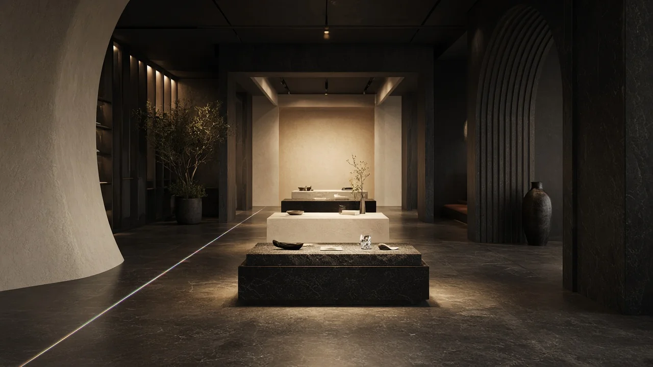
How to use AI to design a storefront layout that works beyond the render
Use AI to compare concepts inside a measured, fixed description of the premises. Keep the real entrance, walls, services and customer tasks in control. Then develop the preferred direction into a dimensioned proposal for the appropriate designers, suppliers and permitting professionals to review.
The same method holds for shops in Edmonton, across Alberta and elsewhere in Canada.
A convincing image is not evidence that the layout fits. AI can make a narrow shop look generous by moving a wall, shrinking furniture or inventing a second window. Those changes are easy to miss when the lighting is beautiful.
The goal is not to remove imagination. It is to give imagination enough constraints that the best idea can survive contact with a tape measure, a stock delivery and a customer trying to find the counter.
Describe the customer journey before arranging the furniture
Start with the tasks people come to complete. A takeaway counter, appointment-based showroom and browse-led shop should not inherit the same layout because the same reference image looked good.
Write down the sequence:
- How does the visitor recognise the business from outside?
- What do they need to understand at the threshold?
- Where do they choose, ask, wait, pay or collect?
- What happens when more than one person needs the same space?
- How do staff replenish, clean and help without blocking that journey?
Observe the existing business if there is one. Note where questions repeat, where queues form and where staff have to move items out of the way. Separate a layout problem from a missing sign or a poorly explained process.
For a fictional specialty-food shop, a pickup customer may need a quick route to a collection point while a browsing customer needs time to compare products. That example suggests separate information and circulation needs; it is not a claim that one layout increases sales by a particular amount.
Build an existing-conditions pack
A useful starting pack includes a measured plan, photographs and an inventory of things the concept must preserve or resolve. Ask the landlord for available drawings, then verify their relevance to the current space.
Record:
- The unit boundary and usable interior dimensions.
- Entrance positions, door swings, windows and vestibules.
- Columns, level changes and fixed built-ins.
- Existing washrooms, service areas and staff-only spaces.
- Power, data and other services relevant to the proposed equipment.
- Existing exits and life-safety features for professional review.
- Delivery access, stock storage and waste handling.
- Equipment and fixtures, with dimensions rather than approximate images.
Label uncertain measurements. A number taken from an old leasing plan should not quietly become a verified construction dimension. Keep site photographs tied to positions on the plan so a reviewer can understand what each image shows.
Do not upload drawings, security information or identifiable customer material to a generative tool without permission and an appropriate review of how the service handles that information. A concept exercise rarely needs private records.
Set the non-negotiables before using AI
Create two lists: things that are fixed and things that can change. This prevents the model from solving a circulation problem by removing a column or moving the entrance.
The fixed list may include the tenant boundary, existing structure and locations that cannot change within the budget. The flexible list may include movable displays, merchandising order, palette and non-structural visual treatments, subject to review of the actual scope.
Add operational constraints. How many people need to work behind the counter? Where does an incoming delivery wait? Which equipment requires a service connection? Where does a customer put a bag while paying?
Accessibility must be part of the layout brief, not a decorative note added after the render. Alberta’s accessibility guidance explains that its Accessibility Design Guide supports interpretation of Section 3.8 requirements. Ask the appropriate professional to apply the current requirements to the actual building and project.
Do not copy a generic aisle dimension from a social post and declare the whole store compliant. Routes, doors, turning spaces, counters and washrooms require a coordinated review, and applicability depends on the project.
Ask AI for alternatives, not a verdict
Use the same constraints to generate genuinely different approaches. Comparing ten images of the same central island with different finishes does not test ten layouts.
Useful alternatives might explore:
- A perimeter-led display with a clear central route.
- A small number of freestanding product islands.
- A consultation-focused arrangement with less open browsing.
- A distinct pickup route separated from longer visits.
Those are concepts to test, not rules for every retail business. Pick the alternatives that address your actual customer tasks.
A constrained prompt could read:
Explore three visual concepts within the supplied measured plan. Preserve every marked wall, column, door and window. Do not invent floor area, glazing or service connections. Show the customer route, a staff replenishment route and the proposed pickup point. Use the supplied fixture dimensions. Label every unresolved assumption. Images are for concept review, not code-compliant construction documents.
A tool may still fail to follow those instructions. Compare the output with the source plan, not with your memory of it. If it changes geometry, keep only the useful visual idea and redraw the layout correctly.
Separate the plan, the mood and the proof
Maintain three distinct documents:
The plan describes what fits and where. It carries dimensions and fixed conditions.
The moodboard describes material, colour, lighting and atmosphere. It helps people discuss the visual direction without pretending it establishes construction details.
The visualisation shows the proposed experience. It communicates the idea but must agree with the plan.
When these become one unlabelled image, assumptions hide. A rounded fixture may look attractive while leaving no verified place for its power connection. A pendant may appear in a render without anyone confirming the ceiling or suspension.
Give each view a date and version. When the plan changes, check the associated visuals rather than allowing an old favourite image to keep circulating as the approved design.
Score the alternatives against the same questions
Create a comparison sheet before the team becomes attached to one image. Use “works,” “needs revision” and “not yet confirmed” instead of giving a precise score to something you have not measured.
| Review area | Question |
|---|---|
| Arrival | Can a first-time visitor understand where to go? |
| Circulation | Do the proposed routes work with real fixture dimensions? |
| Accessibility | Has the relevant professional reviewed the applicable requirements? |
| Operations | Can staff replenish, clean and serve without routine conflicts? |
| Visibility | Can important products, signs and service points be seen? |
| Services | Are power, lighting and other connections planned rather than assumed? |
| Flexibility | Can the business change a display without rebuilding everything? |
| Delivery | Are the cost, approvals, suppliers and sequence understood? |
Record the evidence beside the answer. “Looks spacious” is not evidence of clearance. “Measured route checked on revision B” tells the next person something useful.
Resolve safety and basic operation before debating finishes. A beautiful counter in the wrong location can force expensive changes to the rest of the room.
Test the layout at real scale
Where it is safe and permitted, use tape, cardboard or movable mockups to represent proposed fixtures. Walk the customer tasks with the people who will use the space.
Try ordinary moments rather than an ideal empty-room tour:
- Someone enters while another visitor is leaving.
- A customer needs help while staff are replenishing a display.
- A delivery arrives during a busy period.
- A person waits for pickup without wanting to browse.
- The counter is in use and someone needs to pass behind it.
Do not stage unsafe obstructions or block existing required routes while testing. A physical mockup supplements professional review; it does not replace it.
Take notes about the task, not just whether people liked the atmosphere. “The pickup customer stood in the payment queue because the destination was unclear” is actionable. “It feels premium” is not enough to settle the layout.
Make the storefront and interior agree
The exterior makes a promise about what happens inside. Keep the name, colour system, graphic language and customer information consistent, while adapting each surface to its job.
A dramatic window treatment should not make the entrance difficult to find. A display can invite curiosity without obscuring information people need before entering. Check reflections and the normal lighting at the actual location rather than approving only an evening render.
Connect the signage brief to the interior plan early. If a projecting sign, exterior change or illuminated element is proposed, include its approvals and specialist work in the scope rather than treating it as a final accessory.
For a new brand, develop a small identity system that can extend across the sign, counter graphics, packaging and website. Consistency does not mean printing the same giant logo on every surface.
Use digital features where they help a decision
A changing display can explain options, show product detail or direct visitors. It needs a purpose beyond making the store look technical.
For a screen or projection, identify the owner of the content, the update process and what happens when it is off. Keep essential arrival, price or service information available without requiring a loop, app or scan.
Epson documents projection applications for retail. They can provide useful inspiration for a controlled interior feature. A vendor concept does not establish that the same effect will work with your ceiling, ambient light and operating routine. Ask for a test in the proposed conditions.
Avoid adding facial analysis, tracking or other customer-data collection casually to a concept. If a feature involves collecting personal information, it deserves its own privacy and legal review, not a hidden line in the display supplier’s quote.
Check Edmonton requirements before committing to construction
The City of Edmonton’s guidance for changes to existing buildings covers tenant improvements, alterations and changes of business activity. It lists changes such as walls, washrooms, building systems and exterior openings among work requiring permits, while identifying some cosmetic changes as not requiring permits.
That distinction is not permission to assume your project is cosmetic. Confirm the full scope with City staff and the appropriate professionals. Moving from one business activity to another can also change the review, even when a render shows little visible construction.
The City’s guidance asks for information such as existing and proposed layouts, dimensions, room uses, accessibility provisions and fixed equipment. A generated perspective image does not supply those coordinated documents.
Ask early:
- Is the proposed business activity allowed at this location?
- Which approvals and permits apply to this scope?
- What professional involvement and drawings are required?
- Which decisions need landlord approval?
- What additional regulator requirements apply to this business type?
For example, food service and some personal-service uses may involve additional agencies. Use the City’s current guidance to identify the relevant route; do not assume a retail layout guide settles those requirements.
Price and phase the real project
Separate concept design from technical design, approvals, equipment, construction, fabrication and installation. A low concept fee is not a finished-store price.
Compare quotes against the same fixture schedule and scope. Identify custom pieces, standard products, lead times, installation access, staff training and any work outside opening hours. Confirm who coordinates interfaces such as a custom counter meeting electrical equipment.
Where practical, test reversible changes first. Better wayfinding, a revised display order or a movable fixture can answer a useful question before a fixed element is built. Do not treat “reversible” as a reason to ignore safety, accessibility or landlord requirements.
Keep a change log. If a fixture size changes after approval, recheck its route and service connections. The most expensive version of an AI-assisted project is one where the render keeps looking right while the underlying dimensions drift.
A handoff that someone can build from
The concept handoff should include the measured source information, approved direction, dimensioned proposal, fixture schedule, material intent, signage plan and a list of unresolved decisions. Identify which documents are visual concepts and which have been professionally reviewed for their stated purpose.
Keep approved copy and artwork in editable source files. Keep the final visuals tied to the same plan revision. Record who signs off the budget, construction scope, supplier drawings and public-facing information.
This gives AI a useful place in the process: fast exploration at the beginning, followed by deliberate decisions people can verify.
Frequently asked questions
Can AI create a code-compliant store layout?
Do not treat a generated layout as proof of compliance. Use measured plans and have the appropriate professionals review the applicable building, accessibility and permit requirements.
Do I need a permit to redesign an Edmonton store?
It depends on the scope and business activity. The City distinguishes cosmetic changes from alterations and changes of use. Review the actual proposal with City staff before work begins.
What should I send a storefront designer?
Provide current photographs, measured plans, landlord requirements, fixture dimensions, business activities, customer tasks, budget and known constraints. Label anything that has not been verified.
Should the website match the store?
The identity and practical information should agree, but the layouts serve different tasks. A useful website helps people understand the offer and plan their visit; the store helps them complete the visit.
Design the visit, not just the image
A strong store concept makes the business easier to understand while giving it a distinctive atmosphere. The discipline is keeping that atmosphere connected to the space people will actually use.
Talk to Matt about the storefront, interior experience and customer journey you want to create. KR8TIV can connect the visual direction with signage and print and the website experience around it, with specialist responsibilities and delivery scope agreed separately.